반응형
<글꼴>
상대길이 :기준점의 몇배
절대길이: 보여지는 자체로의 길이 (고정값) ->px
절대길이로 설정을 하게 되면 사용자가 개인적으로 설정한 값에 따르지 않기 떄문에 접근성 문제를 유발할 수 있다
(눈이 안좋거나 등등의 이유로) ---> font-size를 설정할땐 em, rem 등 상대길이를 선택하는것이 좋다.
em
1em=>부모의 font-size
<div class="parent">
안녕!
<div class="child">
안녕!
</div>
</div>
div {
border: 1px solid silver;
padding: 1px;
}
.parent {
color: blue;
font-size: 24px;
}
.child {
color:red;
font-size: 0.5em;
}
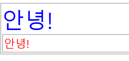
브라우저에 글자 크기가 16으로 저장되어있을 경우 .parent에 2em으로 설정하면 32px로 표현됨
rem
1rem==> root의 font-size (브라우저에 설정된 크기)
<em은 부모요소를 찾아야하기 때문에 em보다 rem을 사용하는것이 조금 더 좋음. >
<뷰포트 백분율길이>
vw
가로길이 100vw
vh
세로길이 100vh
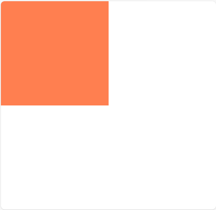
<div class="container">
</div>
body {
margin:0;
}
.container {
background-color: coral;
width: 50vw;
height: 50vh;
}
vmin vmax
반응형 사이트에서 가로모드 세로모드를 대응해야 할때 사용
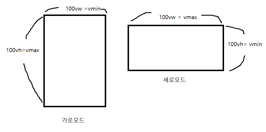
body {
margin:0;
}
.container {
background-color: coral;
width:100vmin;
height:100vmin;

percentage
백분율 값, 보통 부모객체와의 상대적 크기를 지정할때 사용
<div class="parent">
<div class="child"></div>
</div>
.parent {
width: 100px;
height: 100px;
background-color: blue;
}
.child {
width:50%;
height: 30px;
background-color: indianred;
}
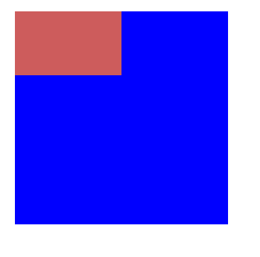
.parent {
width: 50px;
height: 100px;
background-color: blue;
}
.child {
width:50%;
height: 30px;
background-color: indianred;
}

함수표기법
calc()
여러개의 단위를 섞어서 사용할 수 있다.
더하기, 빼기 (곱하기, 나누기+숫자) 가능
<div class="container">
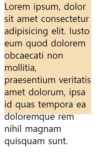
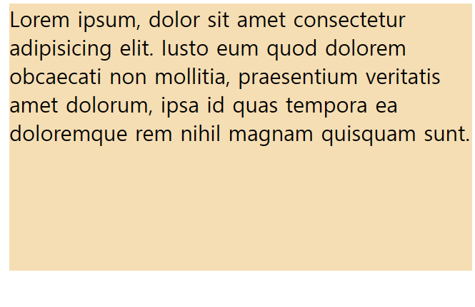
Lorem ipsum, dolor sit amet consectetur adipisicing elit. Iusto eum quod dolorem obcaecati non mollitia, praesentium veritatis amet dolorum, ipsa id quas tempora ea doloremque rem nihil magnam quisquam sunt.
</div>
.container {
width: calc(100% / 3);
height: 200px;
background-color: wheat;
}
+와 - *(곱셈) /(나눗셈) 연산자 좌우에 공백이 있어야 함.
min()
.container {
width: min(100%, 500px);
height: 200px;
background-color: wheat;
}
( ~~, @@@) ~~~과@@@ 중 작은 값을 선택함
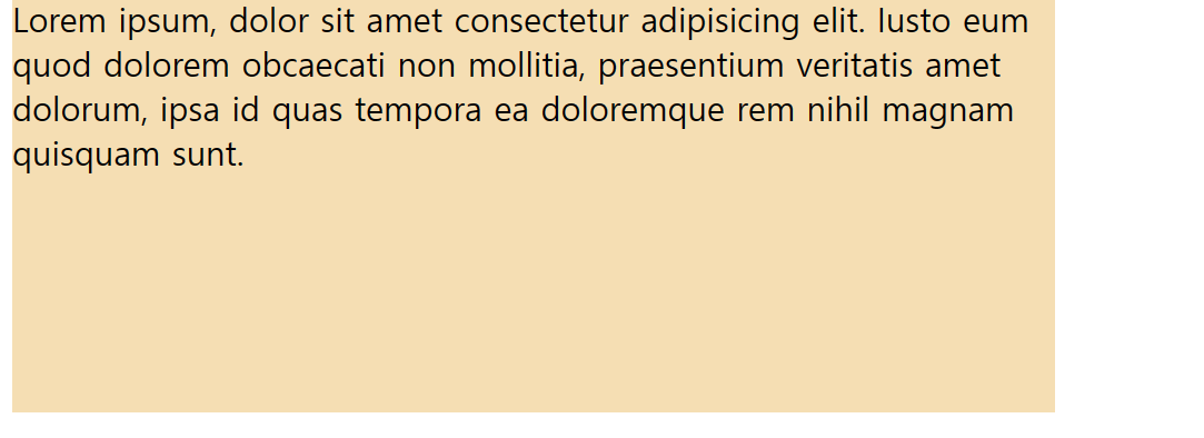
max() -> 둘중 큰값으로 따라감
반응형
'제로베이스_정리' 카테고리의 다른 글
| 레이아웃 (0) | 2024.04.24 |
|---|---|
| 박스모델 (Box Model) (0) | 2024.04.23 |
| 폰트관련속성 (0) | 2024.04.21 |
| selector (셀렉터) (1) | 2024.04.20 |
| CSS ( Cascading Style Sheets) (0) | 2024.04.14 |


