반응형
transisition
<div class="box">
<div class="box-overloay">
</div>
body {
margin: 20px;
}
.box {
width: 100px;
height: 100px;
border: 1px solid black;
position: relative;
}
.box-overloay {
width: 100px;
height: 100px;
background-color: black;
position: absolute;
top: 100px;
left: 0;
transition: all 1s;
}
.box:hover .box-overloay {
top: 0px;
}
transition: all 1s;
all 로 설정을 하게 되면 .box-overloay에 걸린 모든 스타일의 변경이 생길때마다 1s동안 이라는 시간을 설정할 수 있음

all로 설정을 해놨기 때문에 올라가는 것도 1s, 내려가는것도 1s 설정 됨
transition-timing-function 속도 조절
transition: width 2s (가로로 2초동안)
transition-timing-function : linear
transition-timing-function : ease
transition-timing-function : ease-in
transition-timing-function : ease-out
transition-timing-function : ease-in-out
<div class="box">
<div class="box-overloay">
</div>
body {
margin: 20px;
}
.box {
width: 100px;
height: 100px;
border: 1px solid black;
position: relative;
}
.box-overloay {
width: 100px;
height: 100px;
background-color: black;
position: absolute;
top: 100px;
left: 0;
transition: all 3s ease-in-out
}
.box:hover .box-overloay {
top: 0px;
}
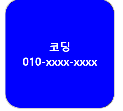
이미지프로필 만들어보기
<!DOCTYPE html>
<html lang="en">
<head>
<meta charset="UTF-8">
<meta name="viewport" content="width=device-width, initial-scale=1.0">
<title>Document</title>
<link rel="stylesheet" href="./main.css">
</head>
<body>
<div id="box">
<div class="box">
<div class="box-overlay">
<p>코딩</p>
<p>010-xxxx-xxxx</p>
</div>
</div>
</body>
</div>
</html>
body {
margin: 20px;
}
.box {
width: 100px;
height: 100px;
background-image: url("./x.png");
background-position: center;
background-size: cover;
border: 1px solid lightgray;
border-radius: 14px;
position: relative;
overflow: hidden;
}
.box-overlay {
width: 100px;
height: 100px;
position: absolute;
display: flex;
flex-direction: column;
justify-content: center;
align-items: center;
border-radius: 14px;
background-color: blue;
top: 100px;
left: 0;
transition: all 0.5s ease-in-out;
}
.box-overlay p{
margin: 0px;
font-size: 10px;
color: white;
font-weight: bold;
}
.box:hover .box-overlay {
top: 0px;
body {
margin: 20px;
}
.box {
width: 100px;
height: 100px;
background-image: url("./x.png");
background-position: center;
background-size: cover;
border: 1px solid lightgray;
border-radius: 14px;
position: relative;
overflow: hidden;
}
.box-overlay {
width: 100px;
height: 100px;
position: absolute;
display: flex;
flex-direction: column;
justify-content: center;
align-items: center;
border-radius: 14px;
background-color: blue;
top: 0;
left: 0;
opacity: 0;
transition: all 0.5s ease-in-out;
}
.box-overlay p{
margin: 0px;
font-size: 10px;
color: white;
font-weight: bold;
}
.box:hover .box-overlay {
opacity: 1;
}
opacity 투명도를 이용해서 만들수도 있음
반응형