반응형
css transform 속성으로 요소에 회전, 크기조절, 기울이기, 이동효과를 부여할 수 있음
한가지의 함수값만 사용하는것이 아니라 여러개의 함수를 스페이스로 구분하여 복합적으로 사용 가능
요소의 변형은 오른쪽부터 왼쪽으로 하나씩 순서대로 적용 함
scale (크기조절)
scale(@x) 또는 scale (@x,@y)
<body>
<img id="cute" src="./x.png" alt="">
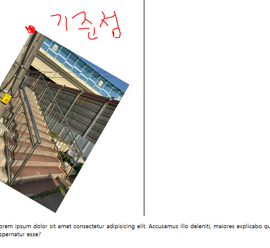
<p>Lorem ipsum dolor sit amet consectetur adipisicing elit. Accusamus illo deleniti, maiores explicabo quia reprehenderit ut fugit omnis ea, magnam libero error pariatur perferendis temporibus fugiat repudiandae, fuga aspernatur esse?</p>
</body>
#cute {
width: 400px;
}

#cute {
width: 400px;
transform: scale(0.5) ;
}

#cute {
width: 400px;
transform: scaleX(0.5) ;
}

rotate (회전)
값을 하나만 받을 수 있음 (양수-시계방향, 음수-반시계방향 가능)
rotate (a)
-deg 45º = > 45 deg
-turn 1turn - 1바퀴
#cute {
width: 300px;
transform: rotate(45deg) ;
}

translate (이동)

#cute {
width: 300px;
transform: translate(100px,150px);
}
방법 : translate (ax) x 축으로만 a만큼 움직임 (한가지 값만 입력했다고 x,y 모두움직이지않음 / translate (ax, ay)
translateX, translateY 사용 가능
단위 : px, rem, em, % 가능
음수 가능
skew (기울이기)
방법 : skew (ax) x 축으로만 a만큼 움직임 (한가지 값만 입력했다고 x,y 모두움직이지않음 /skew (ax, ay)
skewX,skewY 사용해서 한쪽방향만도 가능
#cute {
width: 300px;
margin: 100px;

#cute {
width: 300px;
margin: 100px;
transform: skewX(20deg);
}

transform-origin (기준점)
기본 값 - transform-origin : center
#cute {
width: 300px;
margin: 100px;
}

#cute {
width: 300px;
margin: 100px;
transform: rotate(30deg);
transform-origin: top left;
}
반응형